Candlestick charts are the most popular charting methods for experienced and professional traders. Candlestick charts display the high and low of the given time period, with a vertical line The top vertical line is the upper shadow and the bottom vertical line is the lower shadow.
Line charts
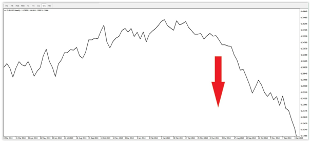
Line charts are a basic way of reading the market's direction and overall trends and clearly show resistance levels. Trading off line charts is not advisable as bar and candles offer more insights for traders.
In the below chart we can clearly identify a downward trend on the EUR/USD currency pair on the monthly chart giving traders a clear indication of the pairs long-term direction. However, bear in mind that the there are peaks and troughs throughout the downtrend that are attractive for Scalpers, Day Traders and Swing traders.
Bar charts
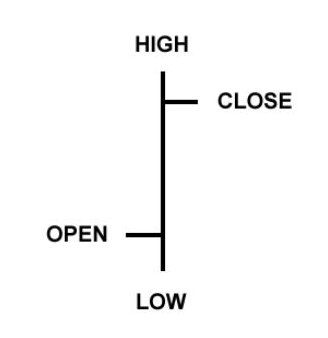
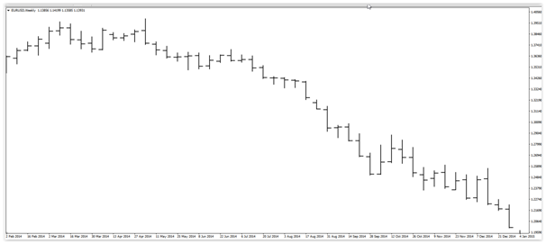
The Bar chart gives us more information for a specific time period. The below example is taken from the EUR/USD currency pair's daily chart. The information available is quite simple to read and also gives us an indication of how the pair traded throughout the specific day.
As illustrated, the horizontal line on the left indicates the market open price, the horizontal line on the right indicates the close price for that day and highlights whether the market closes higher or lower than the open for that day. The vertical lines show specifically the highest and lowest price recorded during that day and indicates the volatility of the market during the day.
Below is the same time-period as the line chart example above. You can see clearly the difference in data available for use when using the bar chart:
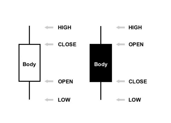
Candlestick charts
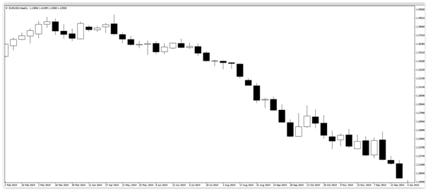
Candlestick charts are the most popular charting methods for experienced and professional traders. Candlestick charts display the high and low of the given time period, with a vertical line The top vertical line is the upper shadow and the bottom vertical line is the lower shadow, both are also known as "wicks". The biggest difference between candlesticks and bars is how candlestick charts display the open and close price. The clock in the middle of a candle represents the range between the open and close prices.
Generally, if the candle is displayed as black (or a darker colour) this represents that the candle closed at a lower price when comparing to the open. On the other hand, a white (or lighter candle) represents that the candle closed higher than the open price. The wicks at the top and bottom represent the market highs and lows for the time frame.
Below is the same EURUSD chart showed you in line and bar form, this time displayed as a candlestick chart (using black and white colour settings). Bullish candles are displayed as white (close and bearish candles are the black: